Practical lessons, resources, and news for the UX/UI community. Learn the real-world skills, methods, and tools that help you build user-first experiences. We make resources like practical tutorials, the Design Tools Survey, the Design Tools Database, and UX Challenges. Join 60k+ other designers and sign up for the newsletter to get product design mastery in just 5 minutes a week.
How to design complex data tables 👩💻
|
Welcome back. As designers, we often focus on technical skills…but what about the subtler signs of growth? This week, I shared a LinkedIn post outlining seven key indicators that you're evolving as a product designer. Spoiler alert: It's not about tools. It's about transforming how you think, communicate, and solve problems. So, as we dive in today, ask yourself: What's been clicking for you lately that has nothing to do with your technical skills? —Tommy (@DesignerTom) The Wireframe:
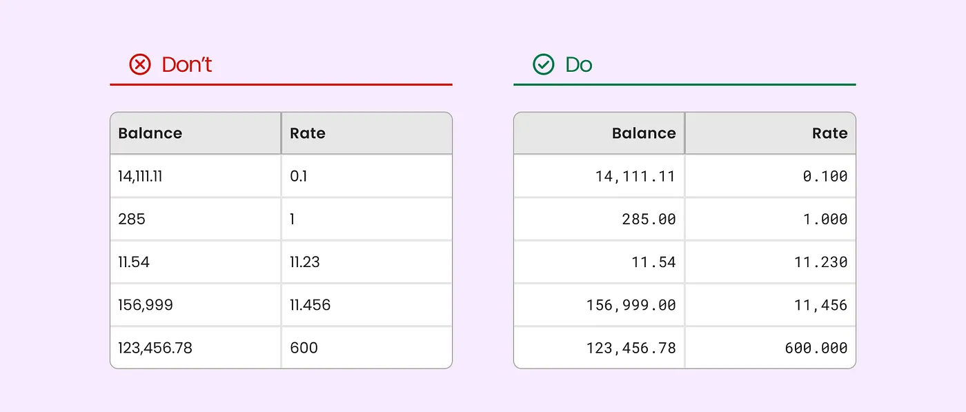
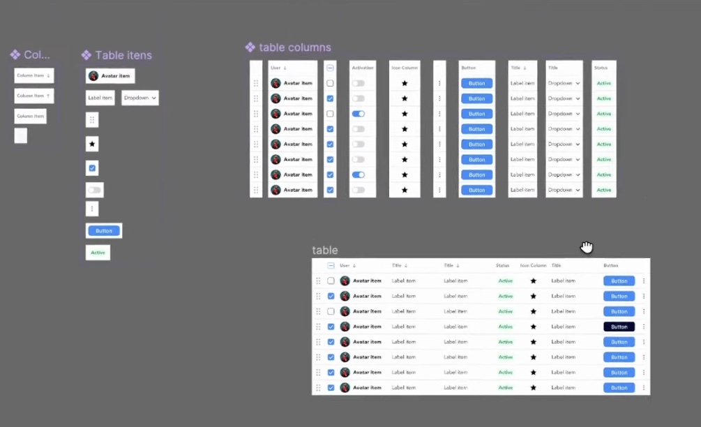
How to Design Complex Data Tables (That Actually Work)Let's face it: complex data tables are the bread and butter of enterprise software…and a massive pain to design well. But with some smart thinking and a few tricks up our sleeve, we can create tables that users actually want to use. Here's how to turn that data chaos into design gold → 1. Plan Before You DesignBefore you even open Figma, you need to understand the beast you're dealing with. Complex data tables require careful planning to ensure they're both functional and user-friendly. Slava Shestopalov suggests creating a table tree diagram to map out all your features, states, and accessories—a visual blueprint that helps you spot potential headaches:
Key questions to ask:
If you’re working with an existing table, start by pinpointing what’s working—and what’s not. This checklist is a great place to start.
|

 |
 |
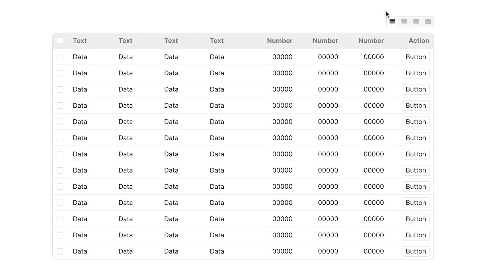
Build in flexibility:
- Allow users to freeze, reorder, hide, and resize columns
- Use expandable rows to allow users to reveal additional details
- Offer options for condensed, regular, and relaxed row heights
 |
3. Focus on Interaction and Performance
With complex data tables, performance isn't just a technical concern—it's a core design feature. These features make your tables more interactive and responsive:
Sortable columns:
- Add persistent sort icons (like small arrows) next to column headers
- Use prominent icons to indicate active sorting (ascending/descending)
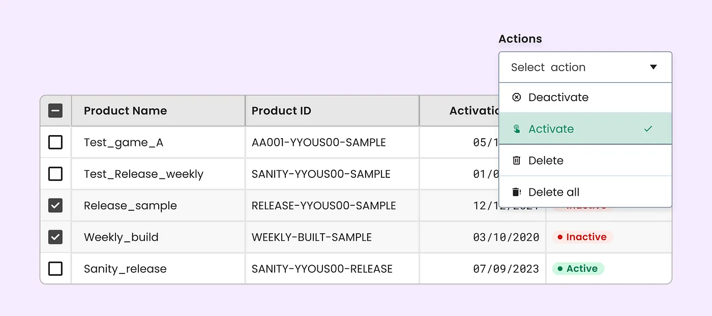
Multi-select and bulk actions:
- Include a select-all checkbox in the header and individual checkboxes for each row
- Display a sticky contextual action bar for bulk operations
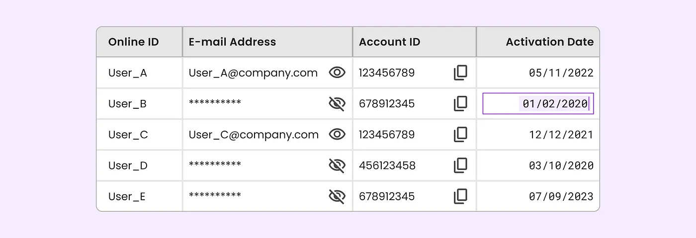
Inline editing:
- Provide clear visual cues for active editing, like a highlighted border
- Offer obvious "save" and "cancel" options, either as buttons within the cell or through clear keyboard shortcuts (enter to save, escape to cancel)
Feedback and confirmation:
- Use subtle animations or color changes to confirm successful actions
- Implement confirmation dialogs for destructive actions
 |
 |
4. Building a Flexible Component System
A modular, flexible system for table components is the not-so-secret shortcut to maintainable, efficient, and adaptable tables.
This Mindesigning video shows you exactly how to create dynamic table components on Figma. A quick breakdown:
- Create reusable cells for different data types (text, numbers, dates, etc.)
- Combine these into column components to easily swap out different data types within a column
- Assemble full table components to easily create and maintain complex tables
- Utilize auto layout and flexible sizing for adaptability
 |
5. Adapting for Mobile
Ditch the traditional row-column structure for small screens. Focus on the data itself rather than its tabular layout. Some techniques to try:
- Present each row as a compact card with key info
- Use a sliding bottom sheet for row actions and vertical accordions to stack columns/combine related columns to reduce horizontal scrolling
- Ensure touch targets are at least 44×44px
- Place pagination controls at both top and bottom
- Avoid hover-dependent actions that don’t translate well to touch devices
 |
Remember: Users don't expect mobile tables to look identical to desktop versions. But they do expect core functionality to exist on both.
The bottom line: Effective table design balances power and simplicity. Start with user needs, focus on core functionality, and then adapt for different devices and interaction methods.
Together with UserTesting
Designers, Let's Take on THiS 2024
Want to transform how you build products? Join me at UserTesting's annual conference, The Human Insight Summit (THiS) in Austin, TX, October 28-30. What you'll get:
- 3 days of insights-driven product design knowledge
- 3 tracks: Experience research, Insights-driven design, Growth & innovation
- Networking with 500+ innovators from top brands
- Practical ways to leverage UserTesting in your design process
Plus, don't miss the legendary THiS party!
Transform your design career with real human insights at THiS—excited to see you there.
| Register today and save 50% with code UXTOOLS |
News, Tools, and Resources: Designing complex data tables
- Learn exactly how Hygraph uses Figma to build complex data tables.
- Stephanie Walter gathered a ton of fantastic resources for designing complex tables for enterprise UXers.
- This guide to responsive accessible tables is an absolute goldmine.
- Building a design system? Check out these great examples of table components.
- Try this table generator plugin on Figma to automate tabular data from a CSV.
- Here’s how to design tables to be read, not just looked at.
Ask DesignerTom: Dealing with super-wide tables
Question: "How do you handle tables that are just inherently very wide, with lots of columns that users need?" - Louis H.
Answer: Horizontal scrolling should be a last resort. Try these strategies first:
- Sticky columns: Lock the most important 1-2 columns in place while allowing the rest to scroll.
- Column grouping: Use tabs or a dropdown to let users switch between logical groups of columns.
- Responsive priorities: Define which columns show/hide at different screen widths.
- Alternative views: Offer a "card" or "list" view option for mobile users.
- Smart defaults: Show crucial columns by default, let users add more.
The goal is to help users find and compare data efficiently. Sometimes that means rethinking how you present information entirely.
UX Tools Job Board
- Notion is looking for a UX Writer to build out its UX Writing practice and team.
- Join the team at Substack as a Product Designer building scalable interviews and flows for a wide range of products.
- Artsy, a startup art marketplace, is seeking a Senior Product Designer to shape the customer experience for its global community of artists and buyers.
What's your biggest pain point when designing data tables? Hit reply and let me know!
Enjoying this newsletter? Let us know here.
UX Tools
Practical lessons, resources, and news for the UX/UI community. Learn the real-world skills, methods, and tools that help you build user-first experiences. We make resources like practical tutorials, the Design Tools Survey, the Design Tools Database, and UX Challenges. Join 60k+ other designers and sign up for the newsletter to get product design mastery in just 5 minutes a week.
Welcome back. Framer just dropped a game-changer for creators: The new Marketplace Dashboard hands creators the keys to their own digital storefronts. As someone who's been in the trenches of design entrepreneurship, I can't overstate how huge this is. It's not just about organization—it's about empowerment. Whether you're a seasoned template maker or just starting out, this is your moment to turn side hustles into serious businesses. —Tommy (@DesignerTom) The Wireframe: How to build your...
Welcome back. Over the long weekend, I've been thinking about isolation in design—and how it can tank your career in this unpredictable tech landscape. That's why I'm doubling down on community and continuous learning. So here's your post-holiday challenge: As we dive back in, think about how you're pushing your craft forward. Join a Slack group. Hit a virtual meetup. Share what you know. Every bit counts. —Tommy (@DesignerTom) The Wireframe: Five tips for mastering micro interactions Create...
Welcome back. Lately, I've noticed a trend of designers dismissing new tools and ideas without truly exploring them. It's made me wonder: How often do we let skepticism morph into creativity-killing cynicism? The truth is, every game-changing product started with someone willing to try something new (like this Twitch icon whose tweet changed my entire life). So this week, I'm challenging myself—and all of you—to approach our work with open minds and a willingness to experiment. Who knows?...