Practical lessons, resources, and news for the UX/UI community. Learn the real-world skills, methods, and tools that help you build user-first experiences. We make resources like practical tutorials, the Design Tools Survey, the Design Tools Database, and UX Challenges. Join 60k+ other designers and sign up for the newsletter to get product design mastery in just 5 minutes a week.
Design principles you’ll *actually* use
|
Welcome back. This week's gem: Mobbin's new abtest.design site. It's a goldmine of A/B test results from top apps, and I'm loving it. These resources are crucial for upping our design game. Seeing real-world UX wins and fails is invaluable, and reminds us why the design community rocks—we're always sharing knowledge. By being open about our hits and misses, we all get better. —Tommy (@DesignerTom) The Wireframe:
Practical Design Principles for Emerging TechAfter 14 years in this industry, one thing's clear: Great designers need solid principles. And with emerging tech like AI and XR reshaping our industry (remember our deep dives?), it's especially crucial to have an A+ design foundation. So today, we’re unpacking four key principle sets that stand the test of time. Let's see how they can elevate your design game in 2024 and beyond → 1. Dieter Rams' 10 Principles for Good Design
Rams' principles are universal, applying to AI interfaces as much as physical products. How I use them: These are my go-to for high-level design discussions, especially with non-designers. When a stakeholder questions a design decision, I frame my argument using Rams' principles. Three of my favorite Rams’ principles:
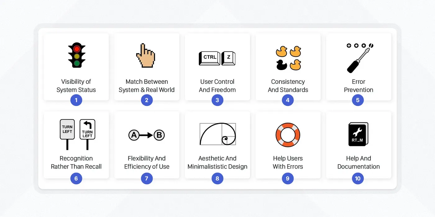
Pro tip: Focus on one or two principles that resonate with your product. Designing a data viz tool? Lean into "Good design makes a product understandable." 2. Nielsen-Norman Usability Heuristics
These are the OG guidelines of UX. They've been around since the '90s, but they're still incredibly relevant—even for cutting-edge tech. How I use them: They're my UX safety net. When I'm stuck or facing a deadline, I run through this list to catch obvious issues. Two heuristics to keep in mind with emerging tech:
3. Gestalt Principles
Gestalt principles aren't just psych class theory. They're practical tools for creating intuitive designs, even in 3D spaces. How I use them: I turn to these for layout and visual hierarchy issues, especially in complex data viz or XR workflows. Three Gestalt principles to consider:
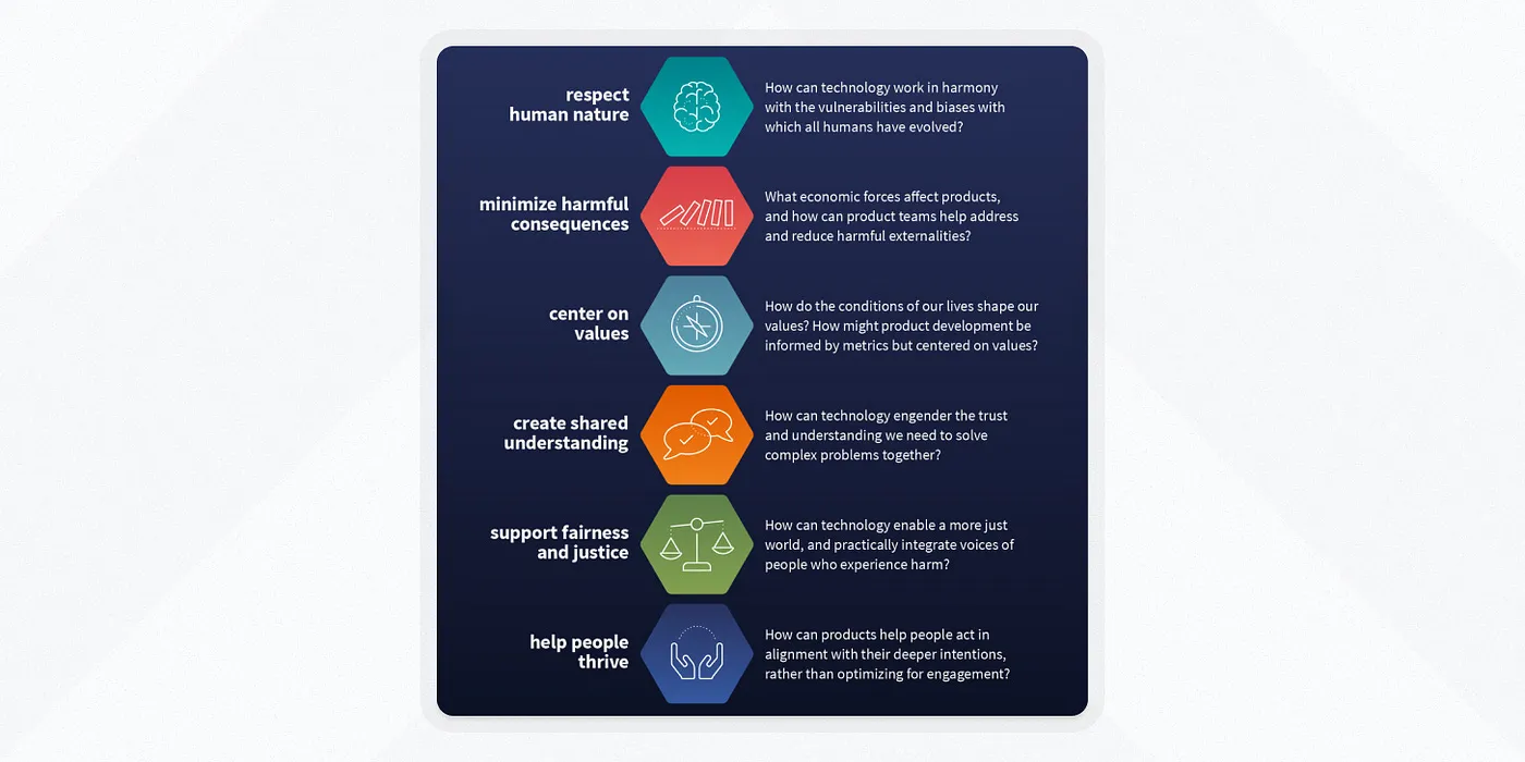
4. Tenets of Humane Technology
These principles help create tech that enhances human well-being…instead of exploiting weaknesses. Real talk? These are often aspirational. But when working on cutting-edge and socially-significant products, they’re a great reality check. Three tenets that are top-of-mind today:
Hard truth: These principles often conflict with business goals. It's our job to advocate for users and find balance. News, Tools, and Resources: Design principles
When to Break the RulesDesign principles are guidelines, not laws. Here's when to break them: 1) When you need to grab attention: Sometimes, a little cognitive overload is exactly what you need to make a point.
Take Apple’s product launch landing pages, which often use a full-screen, motion-heavy hero section—a moment of "cognitive overload" that forces users to pay attention. It's not how you'd want to design a settings page, but for a big product reveal? It works. 2) For power users: If you're designing for pros who use your tool all day, every day, you can push complexity further.
Look at tools like Midjourney or Stable Diffusion. Their interfaces can be complex, with numerous parameters and options. But for power users creating AI art, this level of control is crucial. 3) When conventions fail: If the "standard" way of doing something sucks, try something new. The Browser Company's Arc redefined browser tabs with a vertical sidebar. This breaks convention—but better serves users dealing with numerous tabs, making navigation faster and more intuitive. 4) To differentiate: In a crowded market, sometimes breaking convention is how you stand out. Just make sure the payoff is worth the learning curve. Notion's block-based editing is a perfect example. It was a huge departure from traditional document editors, but it's become a key differentiator. The key? Know the rules well enough to know when (and why) you're breaking them. UX Tools Job Board
What’s one design principle you’re always going back to? Hit reply and let me know Enjoying this newsletter? Let us know here. |


UX Tools
Practical lessons, resources, and news for the UX/UI community. Learn the real-world skills, methods, and tools that help you build user-first experiences. We make resources like practical tutorials, the Design Tools Survey, the Design Tools Database, and UX Challenges. Join 60k+ other designers and sign up for the newsletter to get product design mastery in just 5 minutes a week.
Welcome back. Framer just dropped a game-changer for creators: The new Marketplace Dashboard hands creators the keys to their own digital storefronts. As someone who's been in the trenches of design entrepreneurship, I can't overstate how huge this is. It's not just about organization—it's about empowerment. Whether you're a seasoned template maker or just starting out, this is your moment to turn side hustles into serious businesses. —Tommy (@DesignerTom) The Wireframe: How to build your...
Welcome back. Over the long weekend, I've been thinking about isolation in design—and how it can tank your career in this unpredictable tech landscape. That's why I'm doubling down on community and continuous learning. So here's your post-holiday challenge: As we dive back in, think about how you're pushing your craft forward. Join a Slack group. Hit a virtual meetup. Share what you know. Every bit counts. —Tommy (@DesignerTom) The Wireframe: Five tips for mastering micro interactions Create...
Welcome back. As designers, we often focus on technical skills…but what about the subtler signs of growth? This week, I shared a LinkedIn post outlining seven key indicators that you're evolving as a product designer. Spoiler alert: It's not about tools. It's about transforming how you think, communicate, and solve problems. So, as we dive in today, ask yourself: What's been clicking for you lately that has nothing to do with your technical skills? —Tommy (@DesignerTom) The Wireframe:...