Practical lessons, resources, and news for the UX/UI community. Learn the real-world skills, methods, and tools that help you build user-first experiences. We make resources like practical tutorials, the Design Tools Survey, the Design Tools Database, and UX Challenges. Join 60k+ other designers and sign up for the newsletter to get product design mastery in just 5 minutes a week.
Designing for AI products 📱
|
Welcome back. Last week, startup Cognition AI came out with an AI-powered software engineer called Devin. It’s pretty mind-boggling stuff—the tool can complete entire coding projects (websites, apps, Chrome extensions, etc.) completely from scratch. Kinda like combining all the no-code tools we discussed last week in one platform...plus a lot more. It’s still in testing, but Devin definitely has me wondering: What will the “Devin” of design look like? P.S. ChatGPT's new "Read Aloud" feature created the most passive-aggressive response of a designer chatting with PMs 😆 —Tommy (@DesignerTom) The Wireframe:
How to Design for AI Patterns & ProductsA bet I’m willing to make: You’re going to design an AI product or feature in the next year. If you’re working in software, you’re about to be working in AI. In fact, a recent Figma survey showed that the number of designers, developers, and execs who think that AI will transform their products will double over the next year. What that means: To build great AI products, designers need to recognize that AI isn't just an extension of existing design processes…it's an entirely new frontier. And today, we’re digging into four of the realities of this new era → Heads up: I’m not going to talk about how to use AI in your design process today—you can read more about that here if you’re interested, though. Reality 1: Research is more important than ever.Recently, UX research has taken a backseat across software orgs. But AI represents a major paradigm shift that challenges existing mental models. So instead of feeling around in the dark, efficient orgs will look to UXR for answers. UX researcher Claire Jin explores some of the ways that UX teams and researchers will adapt to address AI:
Reality 2: We’re still establishing a shared language.Unlike traditional software, there is no shared language around AI patterns yet—but it’s starting to develop. Three examples of a this new AI pattern lexicon at orgs and companies? #1: A designer on the Firefly team at Adobe told me that they think of AI patterns in terms of primary and secondary layers:
#2: Similarly, a design group at Microsoft established a UX/UI framework for presenting its AI tool, Copilot, in one of three ways:
#3: Design legend Jakob Nielsen believes that AI introduces the first new UI paradigm in 60 years: intent-based outcome specification. In this approach, the user describes their desired result...but does not specify how to achieve this outcome →
Reality 3: Friction is your friend.In other tech, the more we could “blackbox” the backend ops, the better. But with AI, the tech itself is blackboxed—and humans seek a sense of agency. This can be introduced with intentional friction. Friction encourages human review, fact-checking, and collaboration with the AI system to 1) retain human agency and 2) produce the most accurate results. Some examples:
Reality 4: High-fidelity prototypes are necessary upfront.AI is already challenging to visualize. But beyond that, deploying AI raises ethical considerations around transparency, privacy, and mitigating biases—and static prototypes simply won’t do enough to secure stakeholder buy-in. That’s why hi-fi is critical upon ideation, before you get into the design work. With complex prototypes, you can:
Start with hi-fi, get buy-in, and then start the design work over in low-fi. The takeaway: As AI upends tech, the design community has to stay adaptable. Designers today are setting the stage for the next generation of UX frameworks—acknowledge this responsibility, be open to change, and share with the community along the way. TOGETHER WITH CODUX What If Designers and Developers Worked in Harmony?As a designer, working with developers can often be a pain point. Instead of a hand-off between siloed teams, wouldn’t collaborating directly be ideal? That’s why Codux was developed. Now, designers and development can bridge the gap with a familiar, visual environment. A local app, Codux works on top of the source code of your project, translating all of your visual changes directly into the code—and vice versa. Ready to unlock the dev environment for designers? Try it now. News, Tools, and Resources: Designing for AI
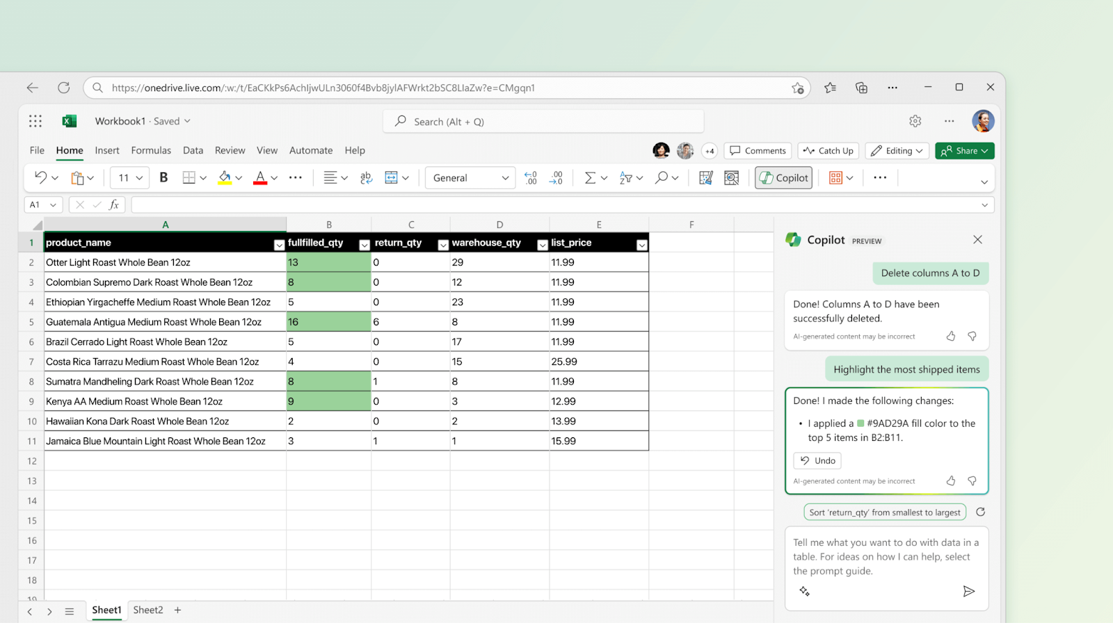
Got a great tool, podcast episode, idea, or something else? Hit reply and tell me what’s up. Case Study: Microsoft Copilot’s Intentional FrictionLast year, Microsoft set the standard for conversational AI with Microsoft 365 Copilot. Copilot brings AI tech to all Microsoft 365 products—and thoughtfully introduces friction in each. Here are three ways purposeful friction preserves human agency in Copilot: Analyzing trends in Excel. In this example, Copilot uses a chat dialog as a turn-by-turn interaction pattern that requires users to prompt the conversation. The output is a short synthesis—with a thoughtfully designed button to “Explain” the synthesis further.
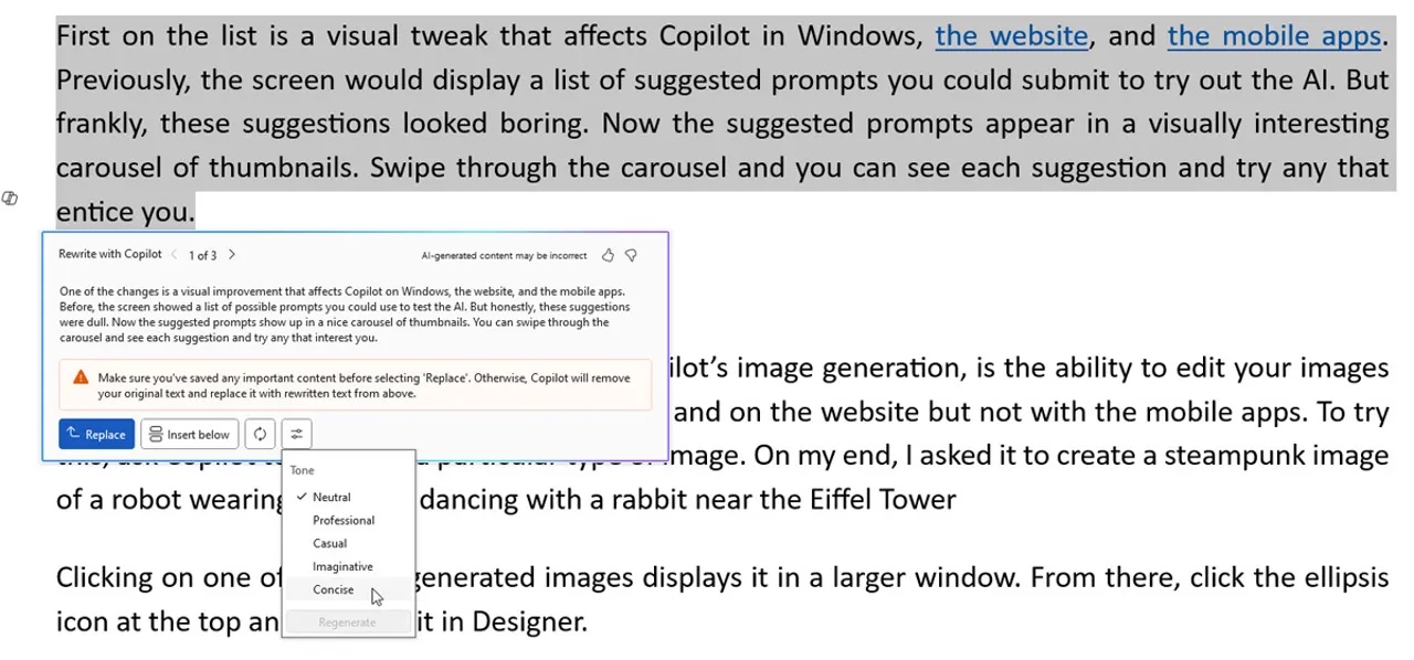
Content configurations in Word. In Word, Copilot provides a dismissible prompt popover with clear, editable properties that alter the output configuration. It then asks the human to keep, regenerate, delete, or adjust after content is generated.
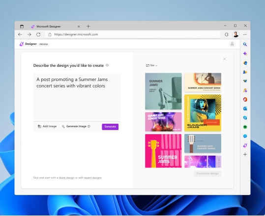
Image generation in Microsoft Designer. Here, Copilot allows the user to add reference media with prompt suggestions. There are multiple outputs generated, requiring the user to select the desired result (with a configurable resolution) before continuing—and then allowing for further customization in the designer.
As the design team explains, introducing appropriate friction prevents treating the AI as an “autopilot” and maintains the intended “copilot” relationship. Thanks for reading! How else have you changed your UX mindset in the age of AI? Hit reply and let me know. See you next week! Enjoying this newsletter? Let us know here. |
UX Tools
Practical lessons, resources, and news for the UX/UI community. Learn the real-world skills, methods, and tools that help you build user-first experiences. We make resources like practical tutorials, the Design Tools Survey, the Design Tools Database, and UX Challenges. Join 60k+ other designers and sign up for the newsletter to get product design mastery in just 5 minutes a week.
Welcome back. This week's gem: Mobbin's new abtest.design site. It's a goldmine of A/B test results from top apps, and I'm loving it. These resources are crucial for upping our design game. Seeing real-world UX wins and fails is invaluable, and reminds us why the design community rocks—we're always sharing knowledge. By being open about our hits and misses, we all get better. —Tommy (@DesignerTom) The Wireframe: Four (actually useful) design principles How to conduct a heuristic evaluation...
Welcome back. Framer just dropped a game-changer for creators: The new Marketplace Dashboard hands creators the keys to their own digital storefronts. As someone who's been in the trenches of design entrepreneurship, I can't overstate how huge this is. It's not just about organization—it's about empowerment. Whether you're a seasoned template maker or just starting out, this is your moment to turn side hustles into serious businesses. —Tommy (@DesignerTom) The Wireframe: How to build your...
Welcome back. Over the long weekend, I've been thinking about isolation in design—and how it can tank your career in this unpredictable tech landscape. That's why I'm doubling down on community and continuous learning. So here's your post-holiday challenge: As we dive back in, think about how you're pushing your craft forward. Join a Slack group. Hit a virtual meetup. Share what you know. Every bit counts. —Tommy (@DesignerTom) The Wireframe: Five tips for mastering micro interactions Create...