Practical lessons, resources, and news for the UX/UI community. Learn the real-world skills, methods, and tools that help you build user-first experiences. We make resources like practical tutorials, the Design Tools Survey, the Design Tools Database, and UX Challenges. Join 60k+ other designers and sign up for the newsletter to get product design mastery in just 5 minutes a week.
Your guide to accessibility in 2024
|
Welcome back. Lately, I've been thinking a lot about the product graveyard—you know, that digital cemetery for once-beloved tech products. It's got me feeling nostalgic…and curious. Why do some products die while others thrive? What can we learn from their demise? In a new TikTok series, I'm diving into the stories of memorable defunct products (think: Google Reader and Vine) and the lessons they offer for designers and product folks. Turns out, there's a lot we can learn from these digital ghosts. Got a defunct product you think deserves the spotlight? Hit reply and let me know. —Tommy (@DesignerTom) The Wireframe:
The Pragmatic Approach to Accessibility in 2024Let's talk accessibility. It's not just a buzzword—it's about creating digital experiences that *anyone* can use, regardless of their abilities. But let's get real: sometimes, accessibility can't be the top priority. Invest all your resources into perfecting accessibility now...and you might not have a product to make accessible later. The key? Set a reasonable bar for accessibility now, laying the groundwork for a more inclusive product down the line. So, how do we push accessibility forward while keeping our product alive and kicking? Let's dive into three ways to find that accessibility sweet spot → 1. Get stakeholders on boardIn our current climate of efficiency and budget cuts, making a strong business case for accessibility is more important than ever. Don't preach to your stakeholders about morals—show them how accessibility expands markets, boosts SEO, and mitigates legal risks. Drawing from Vitaly Friedman's insights, here's how to counter common objections:
Use data, showcase legal risks, and map accessibility needs directly to your product. Start with small, impactful tests to demonstrate value. It's about showing how accessibility can cut costs, boost revenue, and open new markets—all while building a better product for everyone. 2. Make accessibility part of your workflowThe reality is, designers can nail color contrasts, but we can't control if a developer implements that form field to work with a screen reader. Accessible experiences rely on clear communication between designers and engineers. The trick? Start annotating your designs from an accessibility perspective. Some resources to help you get started:
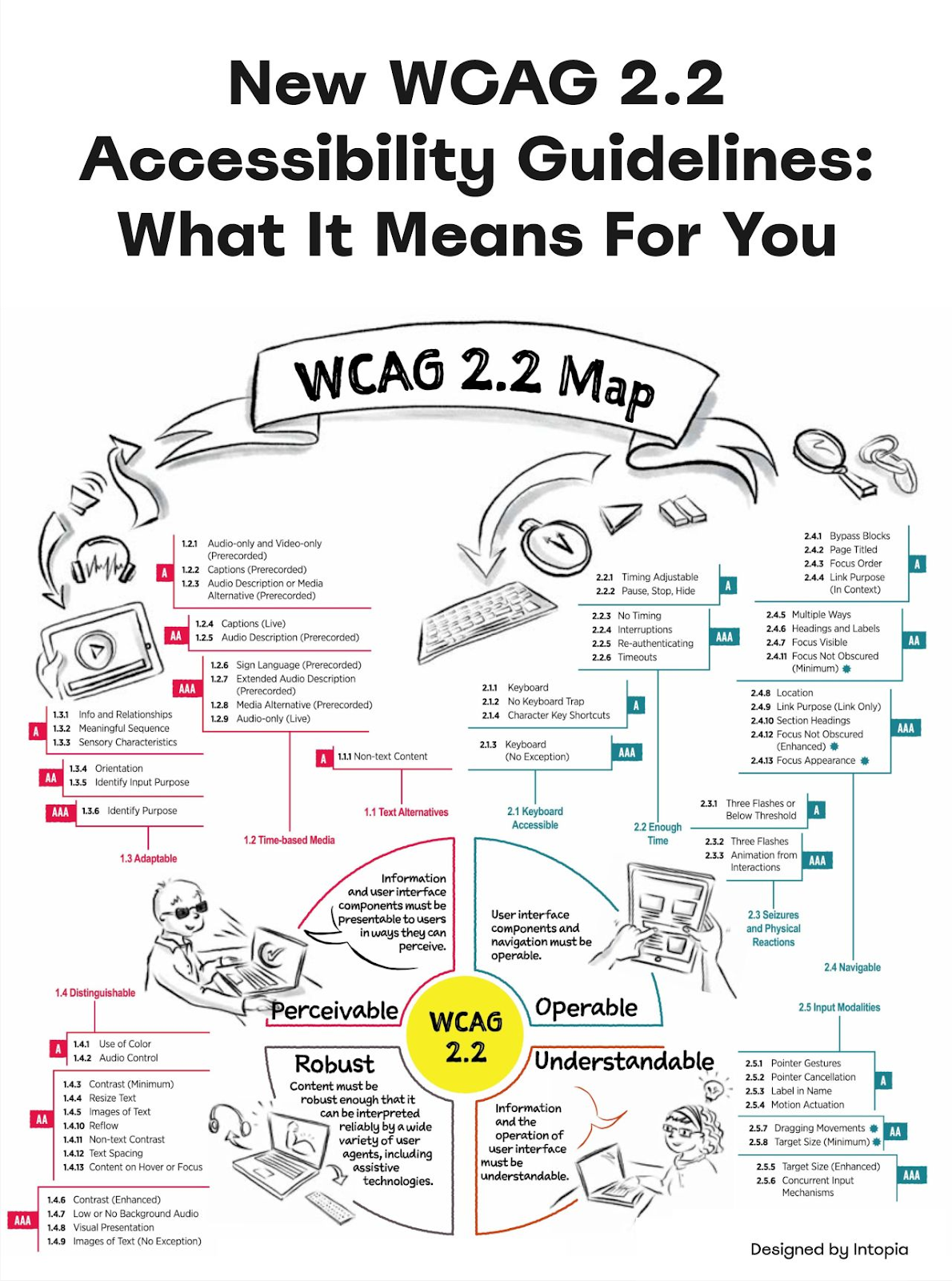
3. Familiarize yourself with the latest WCAG accessibility guidelinesThe release of WCAG 2.2 in October 2023 brings new guidelines that designers and developers need to know. Here are some five key updates you can start with and how to implement them:
1) Focus Visibility: Don't obscure focused elements with sticky headers or modals. Focus should always be visible, at least partially (AA). Tip: Use a :focus-visible CSS selector to style focus states without affecting mouse users. 2) Dragging Movements: Always offer UI controls for dragging movements. Allow users to click/tap on an item, "pick it up," move it, and "drop" it. Tip: Implement keyboard controls for drag-and-drop interactions. Allow users to select an item with the spacebar and move it with arrow keys. 3) Target Size: Click/pointer elements should be at least 24x24px, or provide sufficient spacing around each target. Tip: Use padding to increase the clickable area of small elements without changing their visual size. 4) Redundant Entry: Avoid making users re-enter the same data. Auto-populate repeated content or allow previous input to be selected. Tip: Implement smart defaults and remember user preferences across sessions. 5) Accessible Authentication: Set up accessible auth methods like 2FA, magic links, passkeys, or password managers. Avoid CAPTCHAs or cognitive puzzles (AA). Tip: Consider implementing WebAuthn for passwordless, accessible authentication. Remember, WCAG 2.1 A + AA compliance is still the golden standard referenced in most laws and policies globally. Aim for this as a minimum, but don't stop there. The bottom line: There will always be tension between idealism and pragmatism in accessibility. The key is finding that sweet spot, making meaningful improvements without breaking the bank or timeline. It's not just about compliance. It's about creating a product that more people can use and enjoy. Start small, focus on the basics, and keep pushing forward. Your future self (and your users) will thank you. Create A Design System in 90 DaysWant to create a design system that product teams love? Elevate your enterprise's design system with Dan's Design System in 90 Days cohort. It's ideal if you:
This intensive course is not for solo practitioners or freelancers. It's a strategic investment for those needing long-term ROI from well-structured design systems. The cohort runs once a week for 90 minutes (Tuesdays from 12pm–1:30pm Eastern). It goes for 90 days from September 10–December 10. News, Tools, and Resources: Designing for Accessibility
Got a great tool, podcast episode, idea, or something else? Hit reply and tell me what’s up. Ask DesignerTom: Designing for Autistic UsersQuestion: "How can we make our designs more accessible for autistic users?" - Kelsey M. Answer: Designing for autistic users isn't just a nice-to-have—it's a must-do if we're serious about inclusive design. With nearly 1% of the global population on the autism spectrum, this is a user group we can't ignore. First off, every autistic person experiences the world differently, often with some pretty impressive superpowers in fast learning or laser-focused attention to detail. But they can also face major frustrations with our typically noisy, busy digital world. Here's what to keep in mind: What to Avoid:
What to Embrace:
And remember, autistic kids tend to be visual learners, while adults often prefer well-structured text. So mix it up. Big shoutout to Vitaly Friedman for gathering some killer resources on designing for autism. If you want to dive deeper (and you should), check out his curated list. The UX Tools Job Board
Hiring for a design role, or know someone who is? Submit it here to hit the inboxes of 75k+ talented designers. Thanks for reading! Got thoughts on balancing accessibility with business needs? Hit reply and let me know. |
UX Tools
Practical lessons, resources, and news for the UX/UI community. Learn the real-world skills, methods, and tools that help you build user-first experiences. We make resources like practical tutorials, the Design Tools Survey, the Design Tools Database, and UX Challenges. Join 60k+ other designers and sign up for the newsletter to get product design mastery in just 5 minutes a week.
Welcome back. Framer just dropped a game-changer for creators: The new Marketplace Dashboard hands creators the keys to their own digital storefronts. As someone who's been in the trenches of design entrepreneurship, I can't overstate how huge this is. It's not just about organization—it's about empowerment. Whether you're a seasoned template maker or just starting out, this is your moment to turn side hustles into serious businesses. —Tommy (@DesignerTom) The Wireframe: How to build your...
Welcome back. Over the long weekend, I've been thinking about isolation in design—and how it can tank your career in this unpredictable tech landscape. That's why I'm doubling down on community and continuous learning. So here's your post-holiday challenge: As we dive back in, think about how you're pushing your craft forward. Join a Slack group. Hit a virtual meetup. Share what you know. Every bit counts. —Tommy (@DesignerTom) The Wireframe: Five tips for mastering micro interactions Create...
Welcome back. As designers, we often focus on technical skills…but what about the subtler signs of growth? This week, I shared a LinkedIn post outlining seven key indicators that you're evolving as a product designer. Spoiler alert: It's not about tools. It's about transforming how you think, communicate, and solve problems. So, as we dive in today, ask yourself: What's been clicking for you lately that has nothing to do with your technical skills? —Tommy (@DesignerTom) The Wireframe:...